
Last summer I worked as a UX intern for The Norwegian Digitalization Agency
Digitaliseringsdirektoratet (Digdir) in Brønnøysund, Norway for 2 months. We worked on a case with a cross-disciplinary team, including IT development, data analysis, law and UX design.
My Role
As a UX designer, my role was to conduct user research, create user journeys, design a system design together with IT development team and designing a working prototype, user testing and also leading workshops to bring the big team on the same page. On top of that, I was solely responsible for the hand sketches and illustration drawings.
Tools
Figma, Miro, Adobe Illustrator, Post-its, GitHub, CSS, HTML5
Project Type
Summer Internship, cross disciplinary group project,
Collaboration with Brønnøysundregistrene, Digdir, and Altinn.
Case
What are these mean?
Explore "How web3, blockchain, and wallet technologies can solve problems related to the application for a liquor licence in Norway."
How to solve this technically?
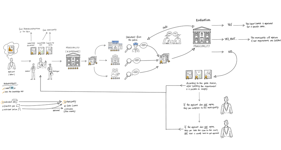
How does the liquor license work?
DICTIONARY
Websites and directories with basic service offerings.

Web dominated by few large platforms that often provide services in exchange for personal data such as Google, Facebook, Amazon, etc.

Fair, privacy-preserving
and decentralized internet infrastructure, that uses blockchain technology to give users power to control their data.
VC
Verifiable credential - Attested attribute such as driving license, student ID, honors, etc.
Wallet
A "digital wallet" in which verifiable identification information can be stored.
Blockchain
A network of servers that continuously update a list of data. Think building blocks.
Liquor Licence
(Skjenkebevilling)
Permission to serve alcohol in Norway.
Proof of Knowledge
(Kunskapsprøve)
Proof that you have documented knowledge of the alcohol legislation that you must have to be able to apply for a distribution licence.
DID
Digital identity.


Goal, Target Group and Scope
The aim was to simplify the liquor licence process in Norway, and improve the user experience in this activity.
The target group was set after the user research:
Restaurant and bar owners who serves alcohol, and case workers in municipalities in Norway.
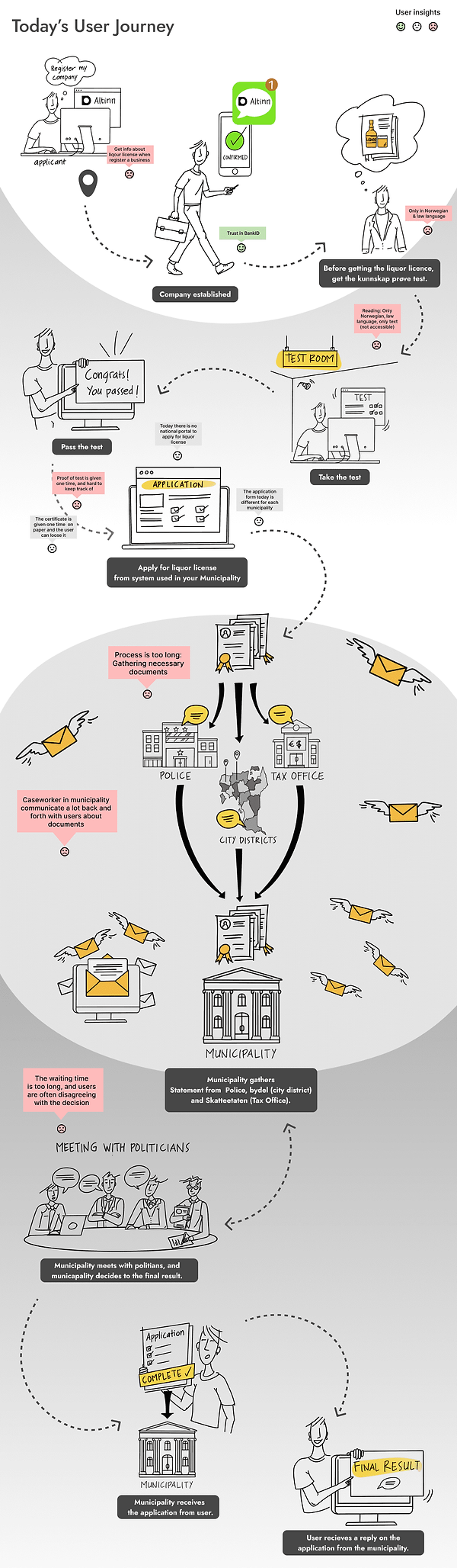
Today's User Journey
Together with law team, we (UX design team) created today's user journey to clarify all the steps of liquor license and to see who are involved in the process.
Based on the user journey, we (UX design team) made interviews with restaurant and bar owners, case workers in big and small municipalities also with a consultant / organisation (who helps applicant throughout the process to facilitate both sides' job) to get more insights about the users.
Analysis of the Findings (Summary)
Pain Points
-
Getting information about the liqour license when register a business.
-
The application process is too long and the knowledge test (kunsskapsprøve) is difficult due to heavy legal / law language, and it is only in Norwegian.
-
Sometimes the applicants feel that the decision from the municipality is unfair if they are refused a liquor license.
-
Case work is a lot of back and forth with the applicants and the case workers.
-
Case workers don't have a good tool to register liquor license.
-
Application forms are different for each municipality and there isn't any national portal for liquor license.
-
The approval of test is given only once and as a paper. If user looses it, there is no way to prove.
Motivations
-
Users trust in BankID usage during company establishment steps.
New Scope
Due to time constraint (8 weeks), the scope of the case was narrowed down to "test certificate", instead of the entire process of applying to the liquor license. So, I new user journey was drawn demonstrating pain points (red), and motivations (green boxes).
Group Allignment
We (UX design team) were given the responsibility to run several workshops to define the problem, bring the group at the same page in order to create the alignment. Also, we needed to boost the creativity in the group, so we followed Google Design Sprints and also some Design Thinking tools. During these workshops we also discussed different system models and decided on the one which can be implemented in the near future. The group of 10 was divided into small teams of 2 from different backgrounds and brainstormed. Each small team came up with different system model and these were discussed all together, decided on one based on value.
System Model

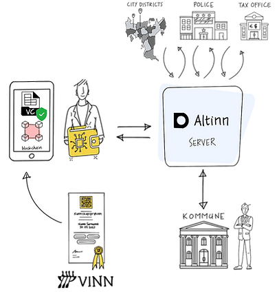
The system model, after discussed within the big group with post-its.
New system model, decided together within the big group. Making it even simpler, less complicated.
What is the new system telling?
-
After you take the knowledge test via Vinn.no, their server will send this to the wallet via the blockchain.
-
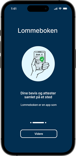
This illustration shows a more decentralized process flow as the test certificate is a verifable credential sent to your own wallet.
PS: A Verifiable credential is a tamper-proof credential that can be verified cryptographically to implement self sovereign identity and to protect your data.
System Architecture of the New Scope
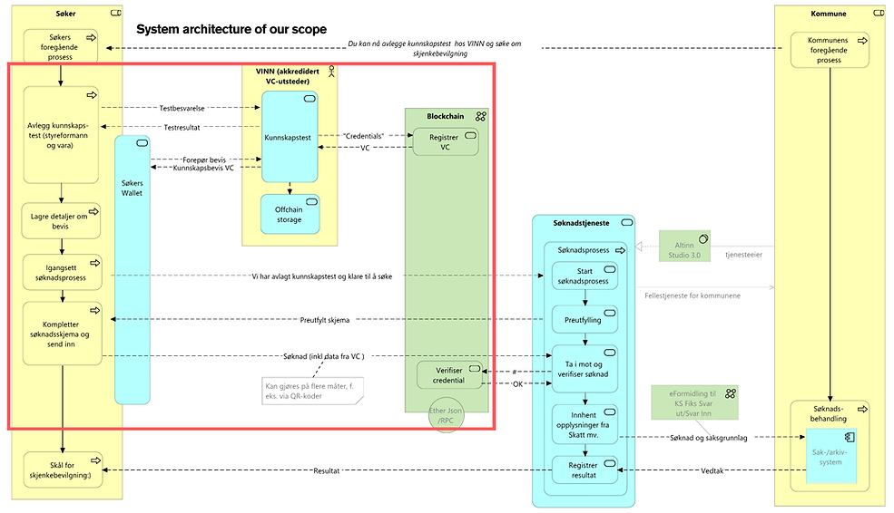
Meanwhile, product development (data analysis team) draw system architecture for the new scope.
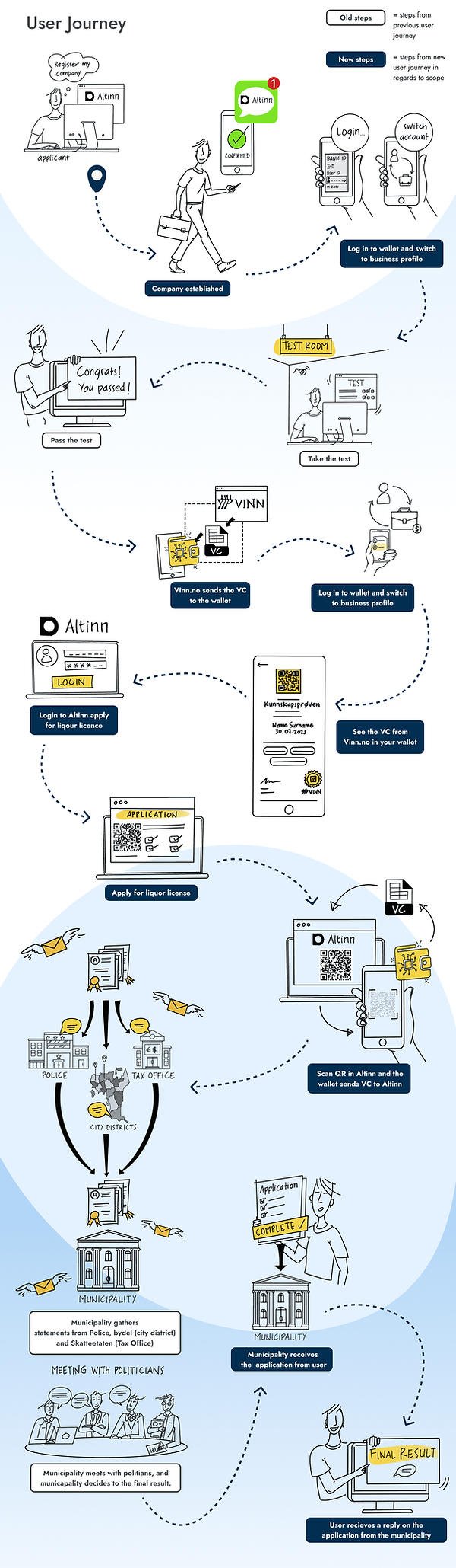
The User Journey with the Solution
Based on the new system model, we created a new user journey, focusing on the chosen pain points below:
-
Users don't have a control over their data. (VC and blockchain were used as a technology.)
-
There isn't any national portal to apply. (Altinn portal was used, since it is already exists as a national platform. As for the test preparation and approval, VINN was implanted to the sytstem for equality.)
-
Case workers don't have a good tool to register liquor license. (Used Altinn, as it is mentioned above.)
-
The approval of test is given only once and as a paper. If user looses it, there is no way to prove. (Wallet technology is used to store Digital.)
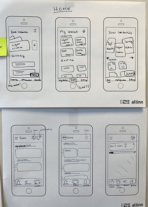
Prototype, User Test, Iterate
We made several low and high fidelity prototypes, user tests, interview and eye tracking user tests.
Several iterations on the prototype were made accordingly.


BUT...
Since UX design team thought that this is not solving the biggest pain point of the users and also doesn't really make sense to change the system, we created a "futuristic" user journey considering "if we have more time for the project. Then, also designed a "guideline" for the Altinn portal, which is what users actually need today...


Reflection of Internship
Working on this case for 8 weeks during summer 2023 was both an exciting and challenging process. We had the creative freedom to provide solutions to real issues but did not work so well as a team, because of different motivations, goals, ethics on working life, and generation differences. Also, because sadly UX design team didn't get respect from rest of the group since design sounds like making things "pretty" just the sake of it. So, we all saw how the project fails when there is no respect for UX designers. I also learned how to guide the multidisciplenary group as a UX designer.
Another and biggest problem was "the case" itself. We were faced by the solution not a "case" where we are supposed to find and define the "problem" as a group after the user research. So, UX designers realized this point and talked with the mentors, however they were not experienced so they realized it after 5 weeks, and it was too late. So,
changing the scope after week 5 didn't give us enough time to find even more valuable insights for the use of a wallet.
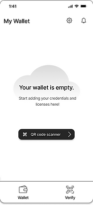
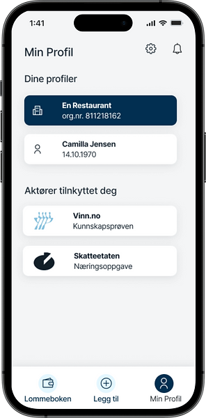
Being able to design a wallet and front page guidelines that has the potential to benefit users to gather their documents, have control and manage their own data was a fun experience. However, UX design team didn't see the value of it, since the pain points were on different stages.
However, it was fun to design a digital wallet where can be many additional features can be implemented.
For example that the user could apply and discover license and documents in one place.
The designers in this team believe there is a lot more to explore in the world of blockchain technology and many ways that design can be used to benefit users in this case.
Reflection in UX Design Aspect
Eye-tracking Test
Due to time constraints, we conducted limited design testing, but we managed to incorporate some eye-tracking evaluations. This proved beneficial in gauging the design's user-friendliness. Furthermore, we made adjustments to certain aspects of the design based on the initial test results. In an ideal scenario, we would have conducted a far more extensive round of design testing if time had allowed. This experience made me to excited to get a deeper understanding of eye-tracking method. Therefore, this semester I'm taking a master course for eye-tracking and working on dark patterns in UI.
Icons
The buttons are whitin the WCAG requirement of
44 x 44 pixels to be a large enough as a clickable area.
Color Palette
Colors inspired by Altinn's design system. They follow the 60-30-10 Rule.
Accessibility
The navigation bar has both icons and description for the
accessibility.